
Attracting a customer to your brand quickly and reliably is vital to any business, but this can sometimes be difficult to do amongst the surplus of other brands in the cannabis industry. You need to grab attention, maintain brand recognition, and excite your customers rapidly in order to stand out using color psychology for your cannabis and edibles packaging. This is where the color of your packaging comes in. 93% of buyers focus on visual appearance when buying a product. In addition, 87.4% of buyers believe that color is the primary reason they are drawn to a brand.
You may know that colors can affect our mood in subliminal ways but you might not realize that colors can also have an effect on how a brand is perceived. Colors can even dictate what identity the customer creates for a brand in their mind. This ultimately sways customers on their purchasing decisions. It’s easy to see how this can apply to standard brands such as McDonald’s and Starbucks, but Cannabis brands can use color psychology in even more specific and unique ways.
Are you selling a specific sativa strain? Hues of yellow, orange, and red would grab attention and indicate the energetic and high-lifting effects of your cannabis. On the other hand, the laid-back and mellow effects of Indica strains are best highlighted through dark greens, blues, and purples. There are numerous ways your packaging can utilize different colors and combinations to elicit the type of response you want from your customers. Check out our list below to see a few more common ways to use cannabis packaging color psychology to your advantage.
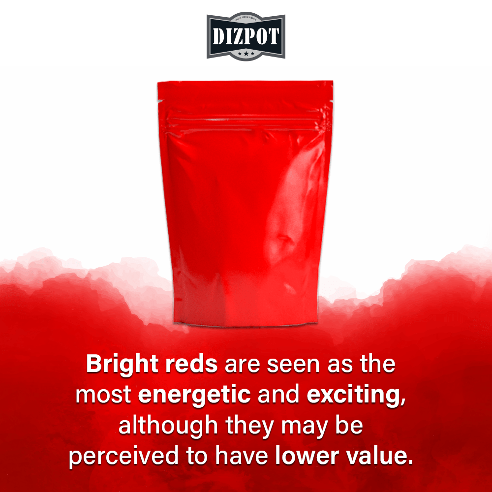
Red
Comes across as exciting, passionate, and bold. Red stimulates the senses and immediately pulls focus to the product. Bright reds are seen as the most energetic and exciting, although they may be perceived to have lower value. Dark reds tend to be seen as professional and luxurious.
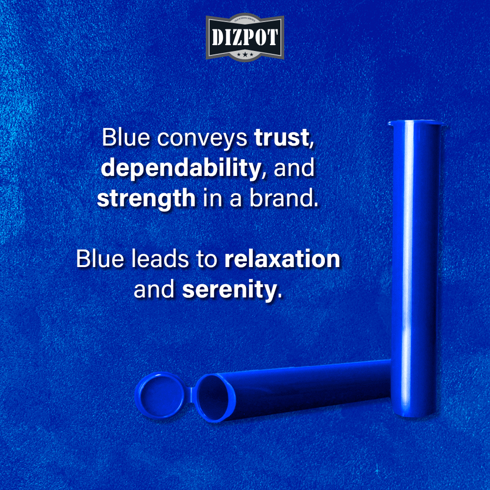
Blue
Conveys trust, dependability, and strength in a brand. Blue leads to relaxation and serenity, and can even stimulate productivity. Light blues tend to be associated with younger audiences, while dark blues works better with older audiences.
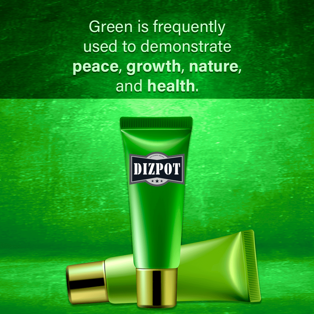
Green
The typical color when thinking of cannabis. Green is frequently used to demonstrate peace, growth, nature and health. Security and wealth are two other common associations. Green is a great color to use but brands using it may have some difficulty standing out.
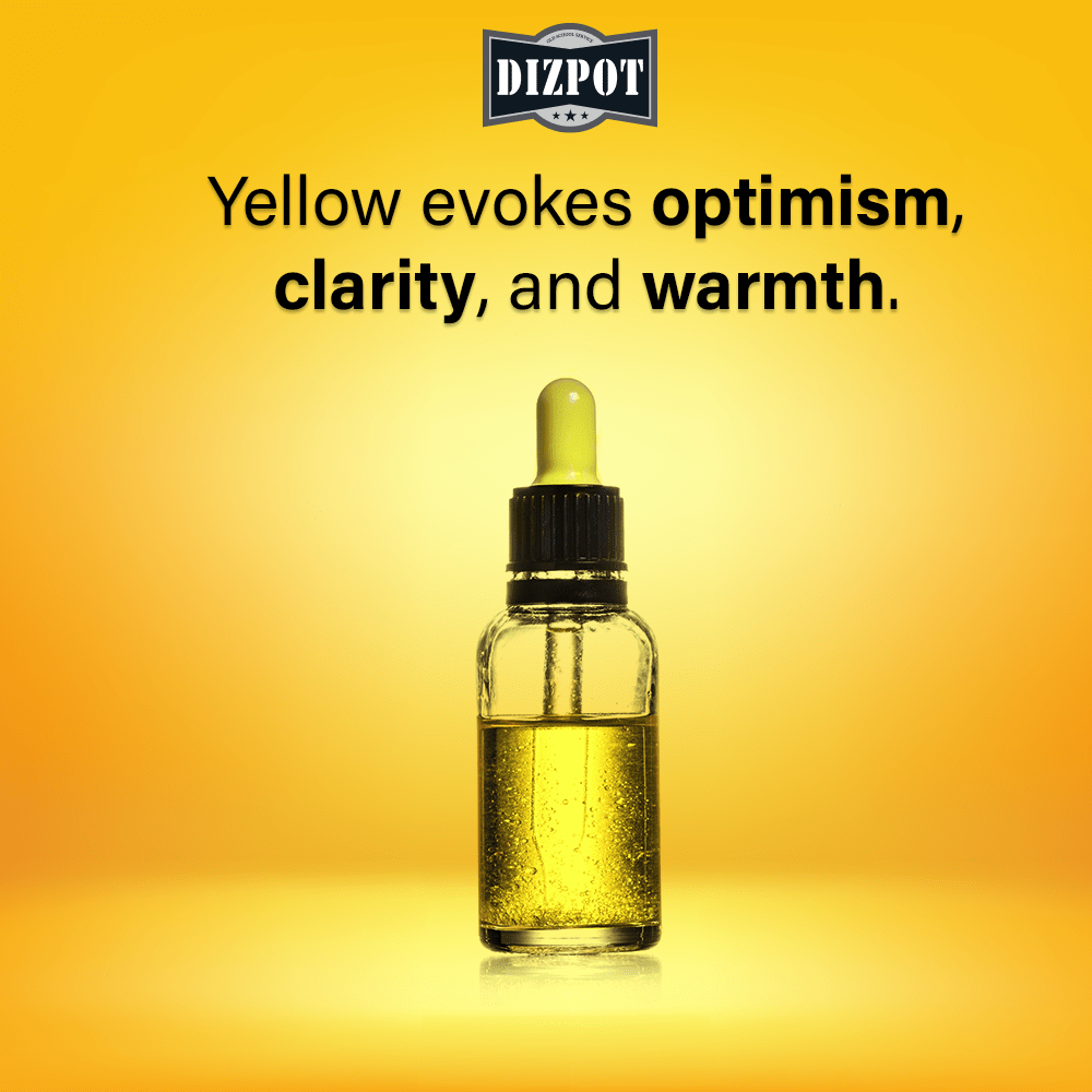
Yellow
Evokes optimism, clarity, and warmth. Yellow is mentally stimulating, increases energy, and promotes both creativity and enthusiasm.

Orange
This color represents extroversion, friendliness, and self-confidence. There is also a sense of adventure and wholesomeness involved with orange. Products with this color typically appear more affordable to consumers.
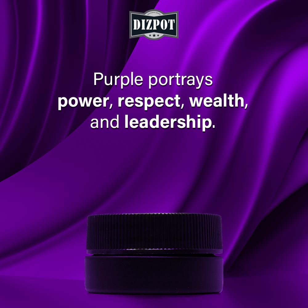
Purple
Female and Youth markets are attracted the most to this color. Purple portrays power, respect, wealth and leadership. Products with this color in them typically give off a feeling of luxury, quality, or exclusivity.
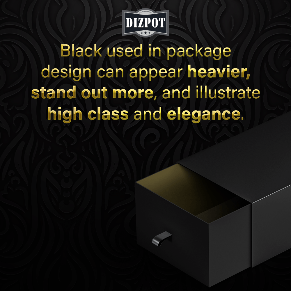
Black
Consistent, reliable, and evoking authority. Black is often seen as dominant and when used in packaging color it tends to appear heavier, stand out more, and illustrate high class and elegance. This color is easily accentuated by other colors.
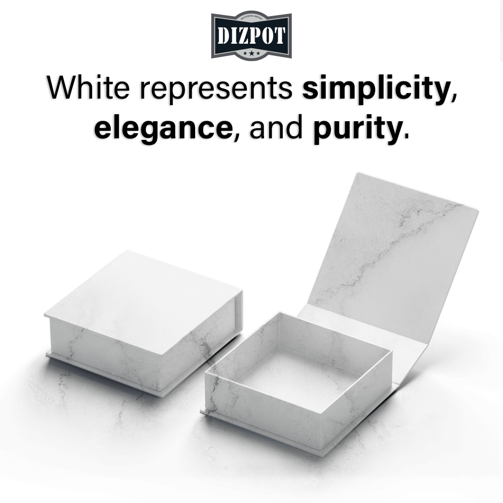
White
This neutral color typically represents simplicity, elegance, and purity. Products with this color give off clean, efficient, and refreshing feelings to the consumer. White is another color that can be accented by other colors to strengthen its perception.